Friday, March 30, 2012

Bridal Veil - a-england

It's that really fun time at uni at the moment - mid-semester test time! So I thought I'd brighten up all our lives with an AMAZING polish... I have 'Bridal Veil' from a-england's recent collection, The Legend, to show you today.


Bridal Veil, a-england the legend, swatch
So when I first put on 'Bridal Veil', the sky was a fairly typical grey and I thought to myself "oh yea, this polish is nice but the holo isn't too obvious on the nail..."

Then this happened...


Bridal Veil, a-england the legend, swatch
This has in an instant become one of my favourite polishes in the world! In shaded light (as above), it's a gorgeous moody black with an added silvery depth. But in sunlight... Look at the amazing bursts of copper that seem to shine like there's a fire glowing beneath that blackened veil. Not to mention that glorious scattered holo effect that I am growing to love more and more. Like the most amazing galaxy in the most beautifully quiet setting with no lights polluting the sky so you can see every twinkling star.


Bridal Veil, a-england the legend, swatch
Sometimes, a green/yellow glow takes over from that copper fire. Equally as gorgeous but slightly more elusive than the copper.


Bridal Veil, a-england the legend, swatch
At certain angles of light, this polish becomes really blackened and the holo becomes even more scattered. Does this polish have a bad-side? NO!


Bridal Veil, a-england the legend, swatch

"A mysterious onyx shroud worn in anticipation of Princess Sabra's impending doom, yet bearing deep within the promise of gleaming hope."
This is what is written about 'Bridal Veil' on the a-england website. Eugenia's words perfectly capture the beauty and sadness of this polish but also that glow from somewhere deep inside it.


A little close-up and macro action. Amazing... Need I say more?


Just in case I needed one more thing to love, this polish is a one-coater. ONE-COATER! But as I've told you before, creature-of-habit here had to do two. I just don't have a steady enough hand to get it all even and pretty with one. So for me, this is an easy two coater. I used a-england 'The Knight' base and 'The Shield' top coat (which I'm having a little trouble with, though that may be for another day). Overall I love this polish beyond what I ever expected. It is so much more spectacular in real life. I got a fair few questions about it while I was wearing it.

I have said it before, if you are yet to try Adina's creations, then hop to it! These are all available on the a-england site and with free world-wide shipping there's no excuse. Thank-you again, Adina, for bringing these wonderful polishes into my life!

Tuesday, March 27, 2012

Per Suede Me - Nicole By OPI

I have another one of Mum's polishes to show you all today. Another slightly less heard of polish from Nicole by OPI. This is 'Per Suede Me'.


Per Suede Me, Nicole By OPI, swatch
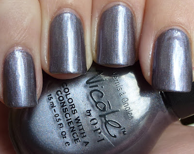
'Per Suede Me' is a metallic grey/purple polish. It's a real chameleon! The colour ranges from looking quite silvery through a dark grey to purple. I didn't think I'd like this one as much as I do.


Per Suede Me, Nicole By OPI, swatch
In bright sunlight, 'Per Suede Me' gives off a silvery/grey metallic look. It's still dark enough that it's very wearable though.


Per Suede Me, Nicole By OPI, swatch
Yes, this is the same polish! This is 'Per Suede me' indoors in indirect sunlight. Everything becomes deeper and darker and gives a real purple look to the grey. The cooler tones really become the focus. This is how I like 'Per Suede Me' best.


Per Suede Me, Nicole By OPI, swatch
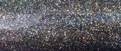
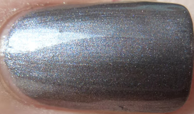
In this close-up, you can see just how densely packed the tiny little sparkly particles are. There seems to be a whole rainbow in there! Isn't it amazing?


This was such a pleasant surprise for me. I'm not a huge lover of metallic looking polishes generally, but if I found more like 'Per Suede Me', I may well just change my mind! I was also pleasantly surprised by the application of this beauty. I thought brush strokes might be an issue, but that wasn't really the case at all. I did 3 coats and I think it needed it, as with 2 coats you could see just the smallest sign of VNL. Plus the third coat gave this polish a bit more depth and it all came alive that little bit more with that little extra opacity.

Saturday, March 24, 2012

Dark Reds - Comparison

Today I have for you all another comparison. This time dark reds. I am an absolute sucker for red polish and in the winter time, dark reds are perfect. Let's get straight on with it...


Dark Red comparison - Royal Rajah Ruby, Thunderbird, I'm Not Really A Waitress, Swing Velvet
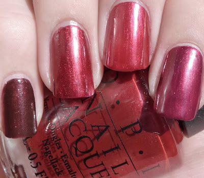
Left to right; OPI 'Royal Rajah Ruby', China Glaze 'Thunderbird', OPI 'I'm Not Really A Waitress' and Essie 'Swing Velvet'. You can see pretty easily that we have none that look the same, although I have have to say in some lights 'I'm Not Really A Waitress' and 'Thunderbird' did look similar (see the last photo). They all have a gorgeous shimmer that is quite obvious in pretty much all light.


Dark Red comparison - Royal Rajah Ruby, Thunderbird, I'm Not Really A Waitress, Swing Velvet
'Royal Rajah Ruby' is a much browner toned burgundy than the others and 'Swing Velvet' is more plummy coloured. Something that really surprised me, I always thought of 'I'm Not Really A Waitress' as a burnt, rusty red, but when I put it on next to all of these, it was verging on looking cherry red!


This is a close-up of the middle two (left - 'Thunderbird', right - 'I'm Not Really A Waitress'). They were by far the closest colour match of the four, although by no means the same. The shimmer in 'Thunderbird' is a bit coarser and a little more obvious. It also has a slightly rustier appearance than 'I'm Not Really A Waitress'. As far as needing both in your stash... Well if you're like me then you definitely need both as they're not dupes (although 'Thunderbird' is actually my Mum's), but if you are unlike me and have any self-control, you probably don't :) Both applied like a dream but personally I prefer OPI's brushes so I would probably reach for that more.


Speaking of formulas... 'Royal Rajah Ruby' had pretty usual OPI good application. As I said, the middle two were great. Both 'Thunderbird' and 'I'm Not Really A Waitress' were perfectly self-levelling and applied like butter. 'Swing Velvet' took a little more patience (I find this with a lot of Essie polishes), not bad though. All were two coats except 'Swing Velvet' as I messed it up a little and had to smooth it out with a third coat. With a slightly steadier hand, two coats would have been fine. The three polishes to the left are all readily available - that's 'Royal Rajah Ruby', 'Thunderbird' and 'I'm Not Really A Waitress'. For the kiwis out there, you can get all three of these on Candy Girl. As for the Essie polish, 'Swing Velvet', I don't know how accessible that is. I've not been able to find out a lot about it to be honest. I think it was part of Essie's Classic Collection? If anyone out there happens to know, I'd love to find out as it's a really beautiful polish that I might have to get my mittens on (it's my Mum's too).

Tuesday, March 20, 2012

A Roll In The Hague - OPI

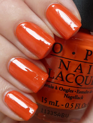
I LOVE what I have to show you today! I'm just going to get right to it... This is 'A Roll In The Hague' which is part of the Holland Collection that came out recently by OPI. This is a fantastic collection which I'm slowly acquiring most of.


A Roll In The Hague, OPI, swatch
This is the most eye-catchingly amazing polish. 'A Roll In The Hague' is a super saturated orange crème polish.


A Roll In The Hague, OPI, swatch
Even in indirect light, this colour still looks like it has a spotlight on it. It seems to illuminate in any light.


Basically I don't have a huge amount to say about 'A Roll In The Hague' because the photos say it all. I will add that there is one more thing to love about it... The formula was absolutely easy to work with. It was pretty much opaque at one coat but I did a second coat just because that's what I do! :) One more thing, this polish isn't hugely shiny when it dries so I would recommend not skipping top coat.
I can't wait to show you some more Holland Collection polishes.

Saturday, March 17, 2012

St Patrick's Day

Happy St Patrick's Day! I said earlier that with my new blog I would get more into the holiday spirit as far as my nails are concerned, so here we go...


I started with a base of 'Cha Cha Cha' from China Glaze's Island Escape collection for summer 2011. What a gorgeous green polish! It's primarily a metallic leafy yellow green with a yellow/gold duochrome effect. You can still notice a little bit of VNL (visible nail line) here with only 2 coats, but I was planning on sponging the tips so I wasn't too worried.


In shade, the gold becomes a little more yellow and everything tones down slightly. I really do love this polish. I love this colour for St Patrick's Day because my whole inspiration for this manicure was green and gold for the leprechauns and their pots of gold :) Which brings me to what I did for the final St Patrick's Day look...


I thought about doing the old stamping of shamrocks or something like that, but I didn't feel like doing something quite so obvious. So this is what I ended up with. It's a bit full on, but I think I like it, although it does also make me think of Christmas... Hmm...


It's like I dipped my fingers in the pot of gold at the end of the rainbow. For this, I sponged on Barry M 'Gold Foil' first on one third of my nails. Next I sponged on a-england's 'Holy Grail' on the tips and then I painted onto half of my nails, a layer of Butter London's 'Tart With A Heart'.


A photo taken in the shade shows you the cooler side to these polishes. Good thing is 'Tart With A Heart' doesn't seem to need much light at all to shine!


As for the formula... 'Cha Cha Cha' was really easy to work with. I was worried that brush strokes could be an issue but no need to have worried. It was fairly thin, but this really wasn't an issue either. I think a third coat would have been better had I been wearing this polish alone, but 2 was fine for this purpose and would be fine for shorter nails so VNL wouldn't be so obvious. I used Essie 'Good To Go' as my top coat and I think I could have done with a slightly thicker top coat as 'Tart With A Heart' has left a pretty gritty feel.

Thursday, March 15, 2012

Tickle My France-y - OPI

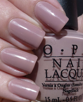
Today I have a gorgeous nude colour to show you. This is one of my absolute favourite polishes! 'Tickle My France-y' was released in 2008 as part of OPI's La Collection de France, although it is a classic colour.


Tickle My France-y, OPI, swatch
So gorgeous and neutral. 'Tickle My France-y' is a bit of a chameleon of a polish. You can see here it's fairly skin-toned with a mauve leaning. This photo was taken in sunlight and you can see how pure a crème this polish is.


Tickle My France-y, OPI, swatch
In this indirect light, the more pink skin-tone comes out to play. 'Tickle My France-y' always retains its slightly purple-y brown tone meaning it doesn't ever get too pink.


Tickle My France-y, OPI, swatch
Here again, you see that oh-so-flattering mauve tone. This is one of those polishes that is so subtle and so simple, it makes your hands look incredibly elegant.


Formula wise... 'Tickle My France-y' is pretty thin but this is far from being a bad thing. The first coat can be a little uneven due to the thin nature of this polish, but on the second and third coats everything evens out perfectly. This is three thin coats with a-england's 'The Knight' base and 'The Shield' top coats.

Monday, March 12, 2012

Comparisons - Pale Pinks

My Mum is here to visit! Yay! And a good part of her visit (among many other things)... she brought her little nail polish collection with her. So I've taken the opportunity to swatch a bunch of her polishes and do some comparisons. Today I've got pale pinks...


Left to right, a-england 'Iseult', OPI ' Mod About You', OPI 'Steady As She Rose', OPI 'Pedal Faster Suzi'. As you can see these colours aren't dupes at all.


Same order as above. All polishes are shown with three coats and no top coat...
'Iseult' - Very sheer. As you can see with three coats it's still not completely opaque. It's such a beautifully clean nude pink colour with a gorgeously subtle shimmer.
'Mod About You' - crème and a much whiter pink than the other polishes. I've said it before, the application on this one is not so good. I have full photos of this polish here.
'Steady As She Rose' - The most similar to 'Iseult'. The same nudey pink colour, but this one's a crème and has that slightly dirty finish that the Pirates Of The Caribbean collection seem to have. It can even appear slightly lilac in some light.
'Pedal Faster Suzi' - clearly very different to the others. The pink of this polish is much warmer and the shimmer is much more pronounced than in 'Iseult'. This polish is absolutely lovely!


As I said earlier, no dupes here, but I think it's always nice to see how polishes actually compare on the nail. I will be doing a few more of these while I can get my hands on all of Mum's polishes.

Friday, March 9, 2012

Emerald Black - Models Own

First up... Lisa you are an absolute STAR!! I have always wanted to have in my nail polish collection the gorgeous multichrome polishes that are Models Own Beetlejuice collection. And recently my fabulous friend, Lisa, who recently moved to London, made that a reality. THANK YOU!

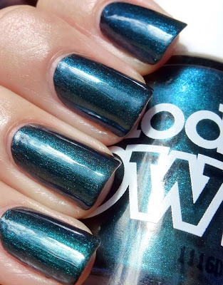
I love love love dark polishes, so naturally I had to start with 'Emerald Black'. I have to say, that in the huge amount of pictures I have looked at of this collection, I've always thought that this was the let down of the collection as it didn't seem to shift much in colour. Boy was I wrong! I could not stop staring at this polish from the minute it emerged from the box. I'll let you see for yourself...


Emerald Black, Models Own, swatch
'Emerald Black' shifts from a gorgeous blackened emerald green through black and right out the other side to a blackened electric blue. What's not to love about this!


Emerald Black, Models Own, swatch
'Emerald Black' packs a shimmery punch when seen in full sunlight. It reflects the light so beautifully. This photo also showcases the real black side of this polish seen at the sides of the nails.


Emerald Black, Models Own, swatch
Let me introduce you to the blue side of 'Emerald Black'. This was the surprise for me. I didn't realise that this blackened electric blue flash would be so prominent in this polish.


Emerald Black, Models Own, swatch
Last but definitely not least, here is the green face of 'Emerald Black'. This is probably the most obvious colour seen in real life with this polish, but I have to say it was quite tough to capture on camera. In saying that, this photo does really capture that emerald green well.


Formula... delightful. 'Emerald Black' really was easy to work with. I used 3 coats for photographing purposes (and because I am still having basecoat issues), but I think 2 coats would be quite sufficient generally.

In summary, just incase you haven't realised already... I love this polish! Everything about it. I'm looking forward to trying the other polishes from the 'Beetlejuice' collection by Models Own. The Beetlejuice collection was released in November last year and I have recently heard that Models Own are releasing a new Beetlejuice collection for Spring/Summer (Northern Hemisphere) 2012. It will contain 3 more multichrome beauties. Have a look at the promo pictures here on Scrangie's blog. I can't wait and I apologise in advance to Lisa, I think I'm going to owe you big time next time you come home to visit us back here in NZ :)

Tuesday, March 6, 2012

Or Divin - Dior

Ahhh my first Dior polish... So I've been wanting to try a Dior polish for some time now and the opportunity arose in the form of the Smith and Caughey sale! I have been lusting after the Holiday 2011 collection that Dior released late last year. I don't really own or wear a lot of gold polish as I am really pale and I find it difficult to find golds that don't make it look I'm ready for a fancy dress party, but I figured why not give this soft gold by Dior a go. This is 'Or Divin'...


Or Divin, Dior, swatch
In direct light, 'Or Divin' is a beautiful pale champagne gold. It's so soft and very wearable. As you can see, the shimmer can lead to visible brush strokes, so care needs to be taken with application.


Or Divin, Dior, swatch
In shaded light, 'Or Divin' becomes a lot golder and more yellow. The good part is that it doesn't ever get too yellow-gold for my liking. I love how this polish has a real elegant feel about it.


The macro shot of 'Or Divin' shows you how beautifully fine and tightly packed the shimmer is.


Right first things first... The brush on this polish is one of the most ridiculous brushes I have ever used. It was paddle-shaped and really big and thick. It held so much polish that I spent more time wiping the brush than I did actually painting my nails. Now to the formula... it was really sheer, this is 3 coats and you can still see a visible nail line. I didn't really have an issue with the finishing opacity of this polish though, as the shimmer reflected the light enough to not notice too much nail line. 'Or Divin' spread really nicely on the nail, it was just the right thickness. Overall I like this polish a lot and I've had a little play with layering this polish and it works really nicely. Once I find a good match I'll be sure to pop it up here for you to see :)

Saturday, March 3, 2012

DS Sapphire - OPI and Four Leaf Clover - China Glaze

So I loved wearing 'Four Leaf Clover' so much that when it came time to take it off and change it for a more work-friendly shade I simply didn't want to. So I thought what could I put over it that would tone it down just enough to wear to work. This is what I came up with...
'Sapphire' from OPI's Designer Series over China Glaze's 'Four Leaf Clover'...


DS Sapphire swatch, OPI, Four Leaf Clover swatch, China Glaze
First off, I'd just like to say that I LOVE 'Sapphire'. I have only ever previously worn it on its own and for some silly reason had never even thought of layering it. The polish is very thin and generally on its own I need about 4 coats, but it looks so pretty layered!


DS Sapphire swatch, OPI, Four Leaf Clover swatch, China Glaze
'Sapphire' is a very fine linear holographic polish. The holo in this polish is actually really quite strong but for some reason I couldn't get a photo to show just how holographic it actually was. From the bottle, you can see that the polish has a slightly blue hue to it, but to be honest most of the colour (when worn alone) comes from the rainbow effect of the holo particles. On top of 'Four Leaf Clover', there isn't really much of 'Sapphire's' base colour showing through and instead it just gave an ice-y sort of veil to the green.


DS Sapphire swatch, OPI, Four Leaf Clover swatch, China Glaze


DS Sapphire swatch, OPI, Four Leaf Clover swatch, China Glaze

A couple of close-ups so you can get a slightly better idea of the rainbow effect that this absolute beauty gives off.


I should probably steer your mind back a little to the last post and remind you of the way that 'Four Leaf Clover' just simply refuses to be colour accurate... Well, just keep that in mind for this post a little too. The difference in colour is nowhere near as bad for this lot though, as 'Sapphire' did bring out the bluer side of 'Four Leaf Clover' so in fact in reality this looked only slightly greener.
To the formula... I actually used 3 very thin coats, as I wanted to disguise the brightness quite a lot. But it is a gem to apply. Even though it's so thin, it still provides really nice even coverage. One note is that this polish is from way back when, before OPI went "big three free" and it STINKS like paint thinner! So good ventilation is a must! Unfortnately being that this is a pretty old polish, it is discontinued. It does pop up from time to time on the internet though and if you can get your hands on it, I would definitely recommend it! It is pure gorgeousness.